
Services
- Packaging Design
- Sustainable Material Visualization
- Brand Identity
- Product Photography Direction
Markets
- Scandinavia
- United Kingdom
- Northern Europe
Outputs
- Recycled Fiber Packaging Design
- Photorealistic Eco-Material Renders
- Sustainable Brand Style Guide
- Retail & Spa-Inspired Visualization
Overview
UME™ is a Scandinavian-inspired brand dedicated to high-performance, eco-friendly household products. The challenge was to create a visual identity for their "Eco-Premium" soap bar that communicates both luxury and environmental responsibility.
WYLLOLAB™ was tasked with the packaging design and visualization, focusing on the use of raw, recycled fibers and a minimalist typographic system that signals "clean" in every sense of the word.
The Challenge
In the eco-friendly market, products often fall into two categories: overly "crafty" or purely utilitarian. UME™ wanted to occupy a third space—the Eco-Luxe. This required a packaging system that feels premium enough for a spa but is demonstrably sustainable.
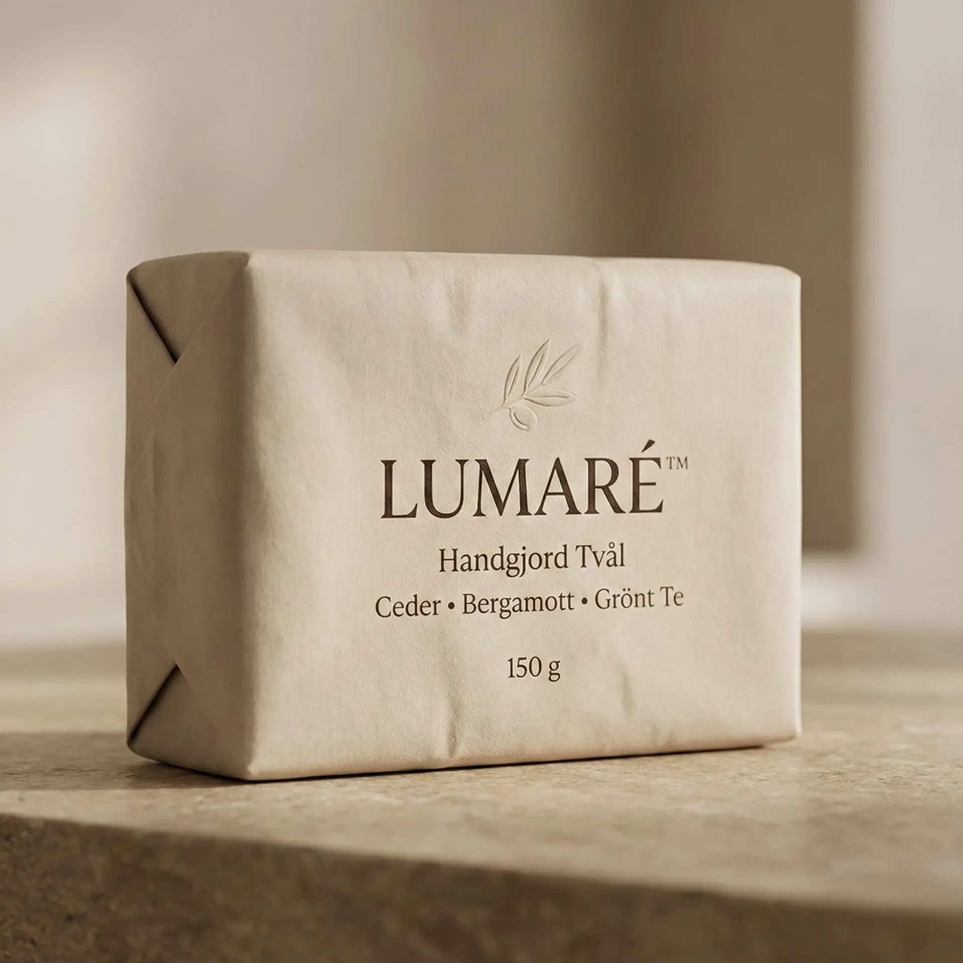
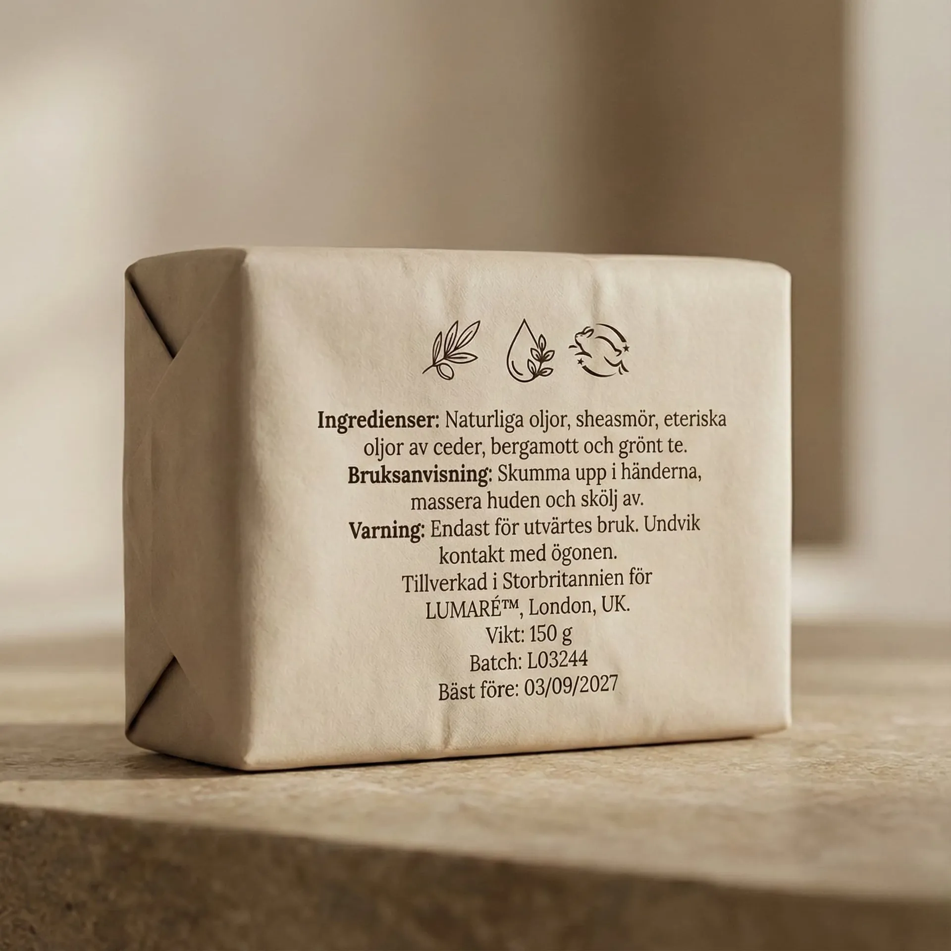
Technically, the challenge was to render unbleached recycled paper with the correct absorbency and texture, ensuring that the natural speckles of the fiber were visible without appearing "dirty" in high-resolution marketing assets.
What We Did
1. Minimalist Packaging Architecture
We developed a "less is more" design philosophy:
- Typographic Restraint: Used a single, lightweight sans-serif typeface to ensure the brand name and scent were the primary focus.
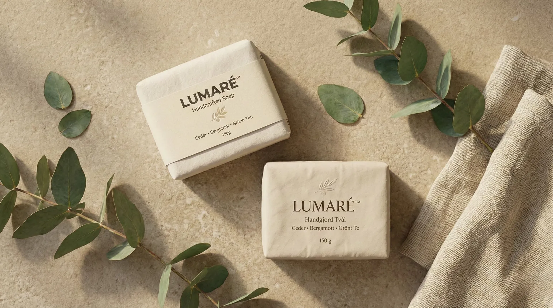
- Natural Color Palette: Grounded the visuals in soft grays, off-whites, and forest greens to reinforce the product's organic origins.
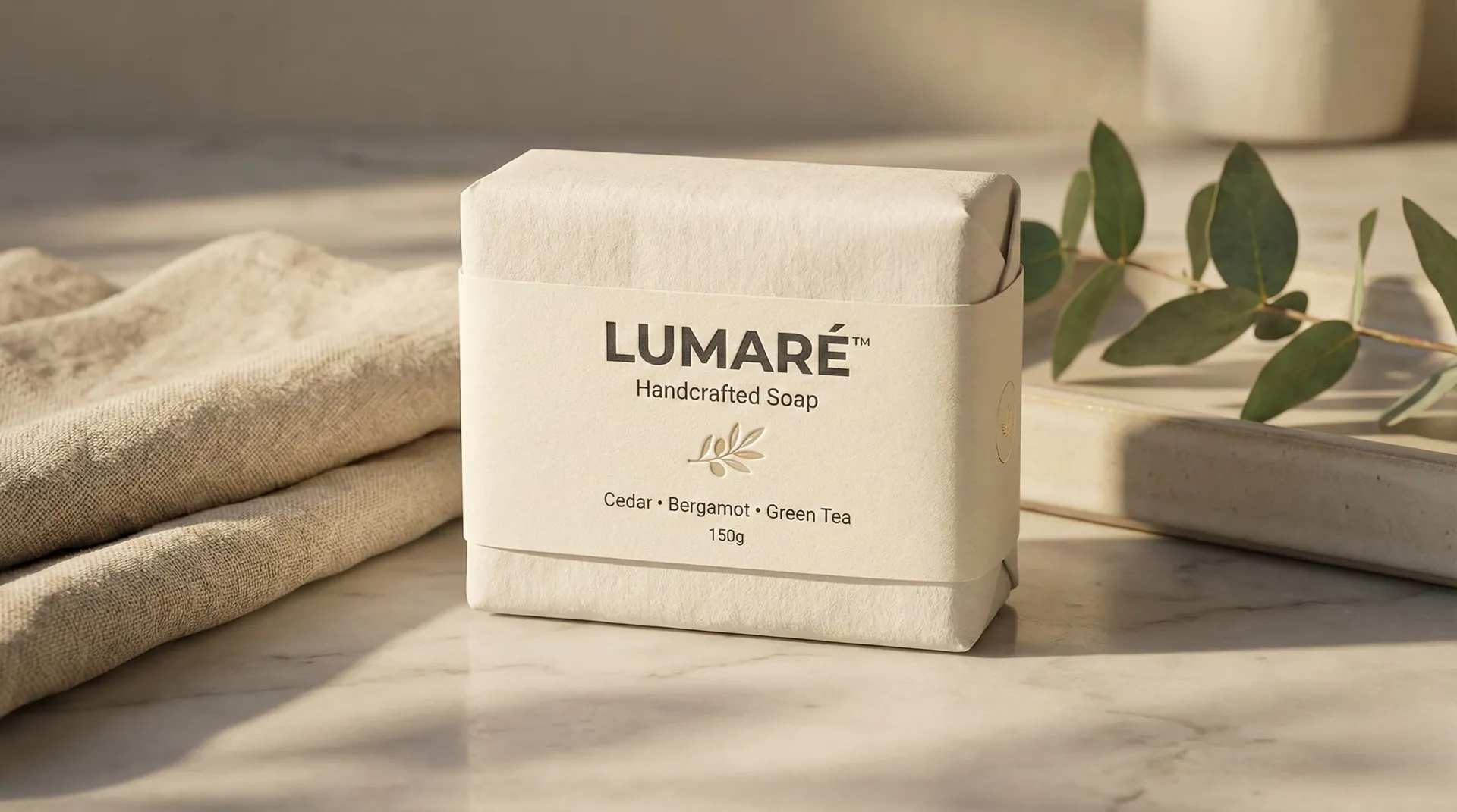
- Unwrapped Aesthetics: For the digital renders, we focused on the interaction between the raw soap bar and its minimal paper sleeve.
2. Sustainable Material Simulation
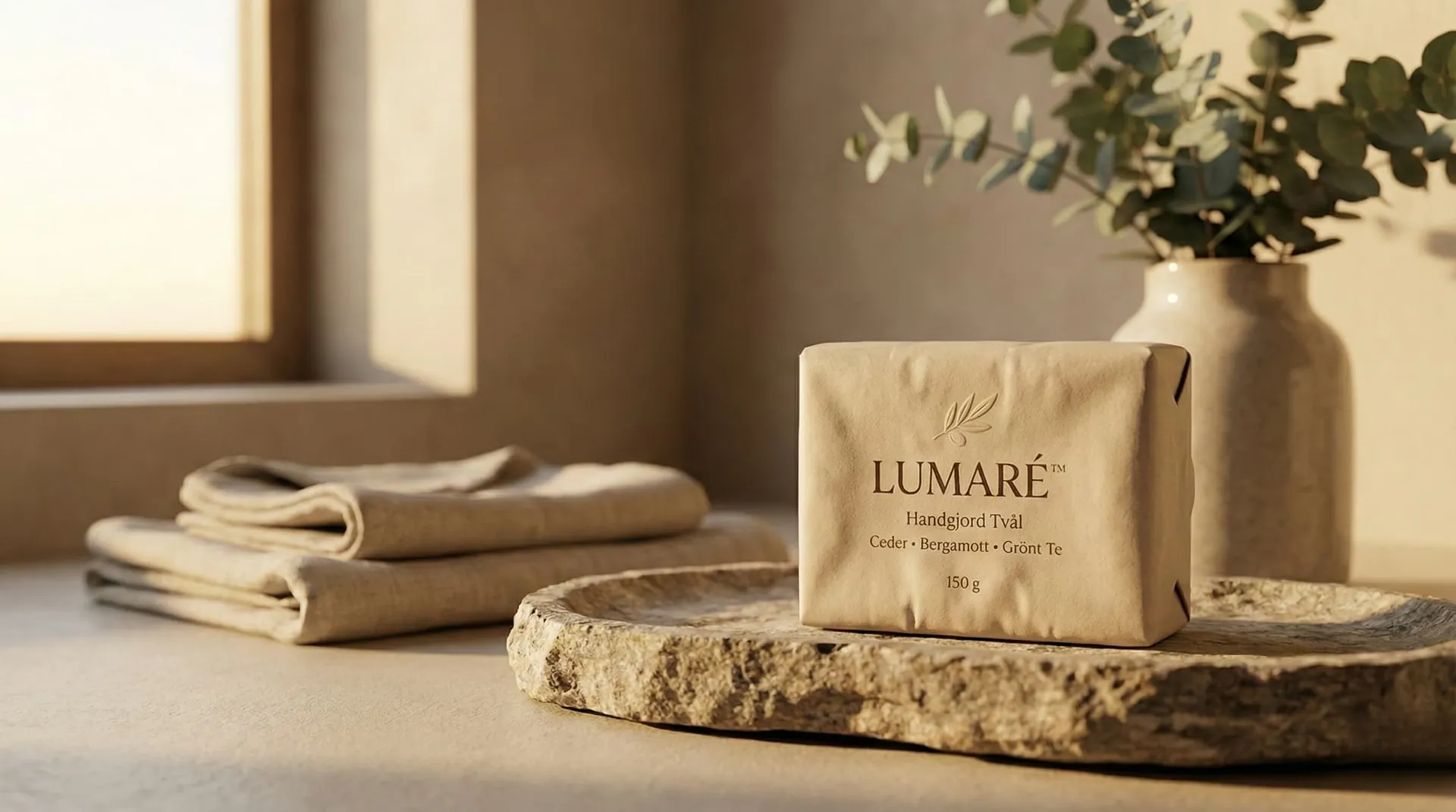
- Fiber-Rich Shaders: Developed custom maps for the paper sleeve that accurately simulate the light-absorbency of recycled stock.
- The "Ume" Signature: Captured the unique, hand-stamped logo on the soap bar surface, showing the slight "slump" and texture of a cold-process soap.
- Environment Context: Placed the product in spa-like environments featuring raw linen, light wood, and stone to anchor the eco-premium positioning.
3. Visual Storytelling
- Texture Over Clutter: Focused on macro shots showing the linen napkins and the grain of the soap.
- Boutique Transparency: Created "cleanroom" style shots on pure white backgrounds to emphasize the ingredient purity.
Visual Story
Outcome
The UME™ Eco-Premium project has redefined the brand's position in the household category.
- Market Differentiation: Replaced generic "eco" branding with a sophisticated visual language that commands a 25% price premium over competitors.
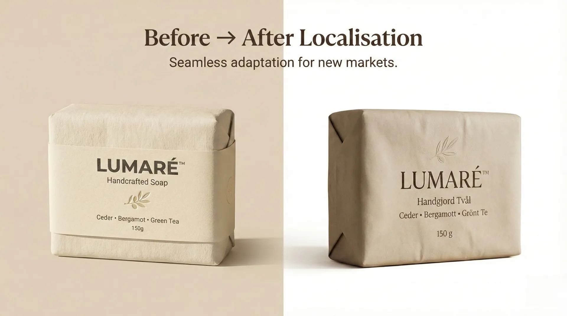
- Global Synergy: The minimalist design has been easily adapted for the Swedish and UK markets, maintaining perfect brand cohesion.
- Sustainable Success: The CGI-first approach allowed UME™ to test three different recycled fiber types for their packaging virtually, saving months of physical R&D.