
Services
- Label Design
- 3D Rendering
- Regulatory Compliance
- Brand Identity
Markets
- United Kingdom
- European Union
- North America
Outputs
- Photorealistic Amber-Glass Renders
- Multi-Market Label Hierarchy
- Comparison Visuals (Clinical vs. Boutique)
- 4K Social Media Assets
Overview
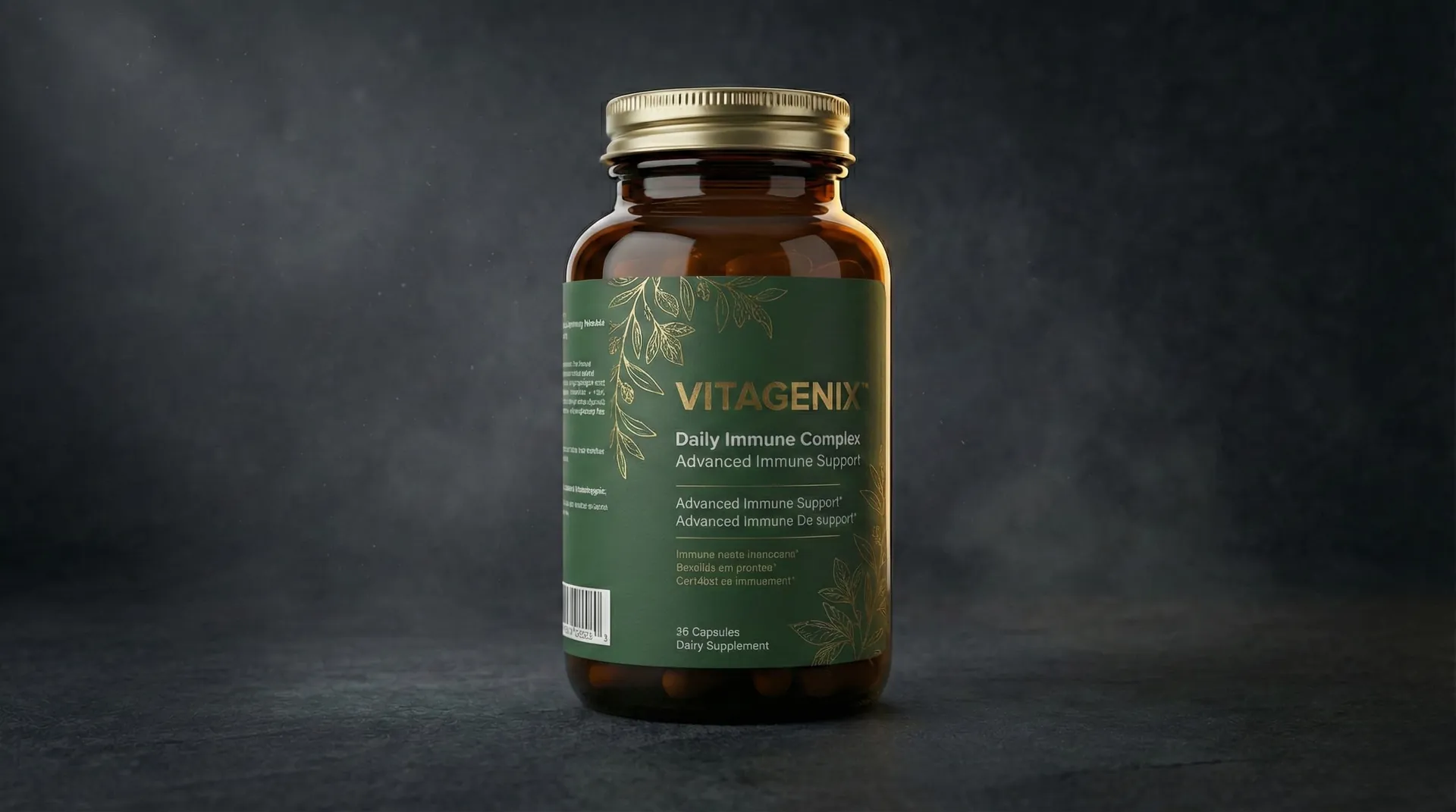
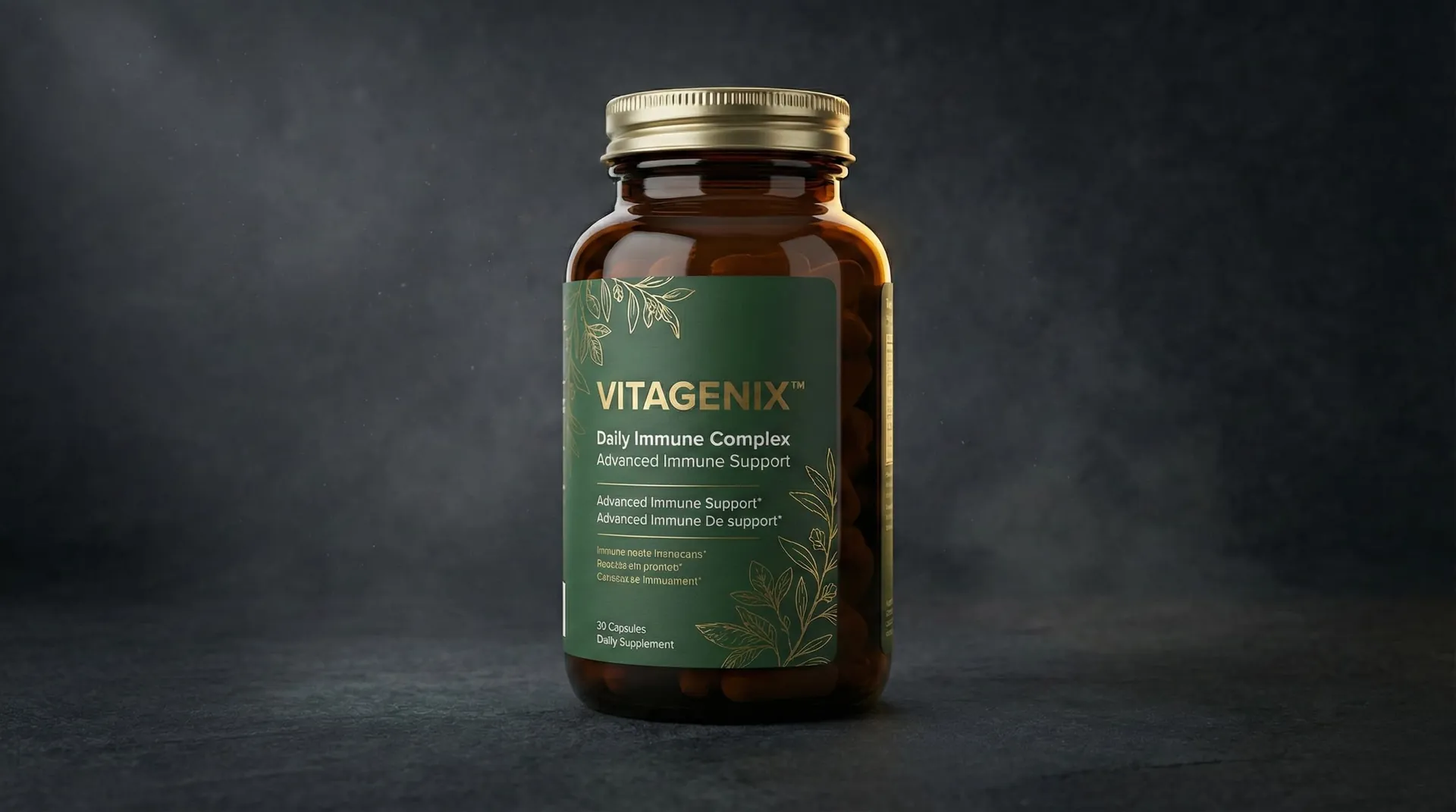
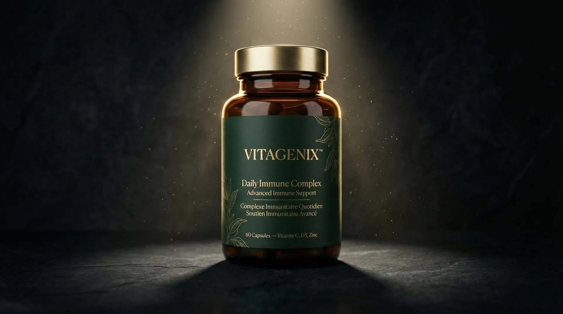
Vitagenix™ is a high-potency immune support brand that sought to bridge the gap between "clinical transparency" and "boutique luxury." The challenge was to move away from the cluttered, additive-heavy aesthetic of traditional supermarket supplements and towards a more restrained, trustworthy presence suitable for high-end wellness retailers and pharmacy-led e-commerce.
WYLLOLAB™ was tasked with redesigning the label architecture to handle dense regulatory data across three languages, while producing advanced pharmaceutical-grade 3D visualizations that emphasize the purity and protection offered by the dark amber glass packaging.
The Challenge
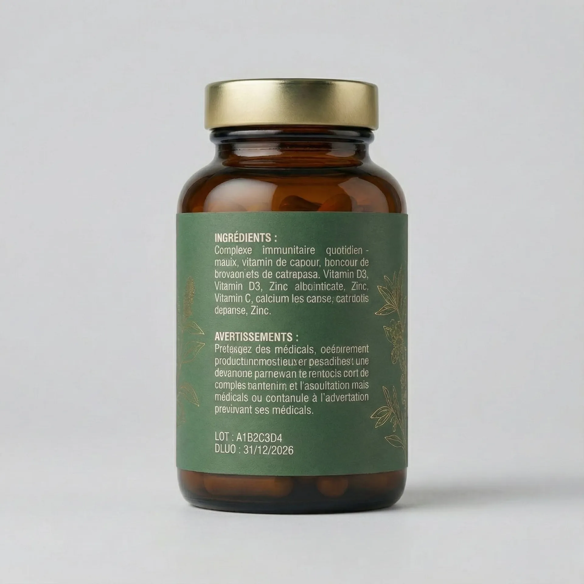
The primary obstacle was the information density. Supplements have strict legal requirements for dosage, ingredient breakdown, and caution statements. Adapting this for the UK, French, and Spanish markets on a single 150ml bottle label required surgical precision in typography and white-space management.
From a visualization standpoint, amber glass is notoriously difficult to render with depth. It needs to look "medicinal" yet "desirable," requiring a delicate balance of amber transparency, internal liquid/capsule refraction, and high-frequency label texture.
What We Did
1. The "Boutique-Clinical" Aesthetic
We developed a design system that balances trust and luxury:
- Typographic Hierarchy: Used a structured grid to separate the "marketing" front face from the "functional" data zones.
- Botanical Accents: Integrated subtle, fine-line botanical illustrations to signal the organic origins of the ingredients.
- Material Contrast: Paired a premium matte-finish paper label with the glossy, Protective Amber™ glass of the bottle.
2. Physical Material Simulation
Using our proprietary rendering pipeline, we achieved:
- Subsurface Scattering: Accurate light penetration through the amber glass to suggest the density of the contents.
- Macro Label Fidelity: 8K texture mapping showing the slight grain of the recycled paper label stock.
- Dynamic Lighting: Controlled reflections that highlight the bottle's silhouette without obscuring the localized text.
3. Localization Strategy
- Trilingual Adaptation: Rebuilt the nutritional grid to accommodate English, French, and Spanish without reducing font size below the legal readability threshold.
- Regulatory Symbols: Harmonized the icons for vegan, organic, and sustainability certifications across all target territories.
Visual Story
Outcome
The Vitagenix™ relaunch has successfully repositioned the brand at the top-tier of the supplements market.
- Retail Expansion: The 3D visualizations were instrumental in securing shelf space at three London-based luxury wellness boutiques.
- Reduced Time-to-Market: By using digital twins for all localization approval steps, Vitagenix saved 4 weeks typically spent on physical prototyping and photography.
- Visual Superiority: The high-fidelity renders allowed for consistent brand presentation across the New York, London, and Paris markets simultaneously.